A DOM element can be made droppable at a specified target using the droppable() method of the JQuery UI.
Syntax:
The droppable () method can be used in either of its two acceptable forms:
- $(selector, context).droppable (options) Method
- $(selector, context).droppable (“action”, params) Method
First Method: The droppable (options) method:
To specify that an HTML element can be used as an element in which other elements can be dropped, the droppable (options) method is used where the behavior of the elements involved is defined by the options parameter.
Syntax:
$(selector, context).droppable (options);
Multiple options can be used at a time using a JavaScript object by separating them using a comma.
Syntax:
$(selector, context).droppable({option1: value1, option2: value2..... });
The popular options that can be used with this method are listed below:
| Option | Uses |
| accept | To control which draggable elements are to be accepted for dropping. The default value is *. |
| activeclass | To specify a string representing one or more css classes to be added to the droppable element when an accepted element (one of those indicated in options.accept) is being dragged. The default value is false. |
| addclasses | To restrict the ui-droppable class from being added to the droppable elements, when set to false. The default value is true. |
| diasabled | To disable the droppable, when set to true. The default value is false. |
| greedy | To control which draggable elements are to be accepted for dropping on nested droppables. Any parent droppables will not receive the element, when set to true. The default value is false. |
| hoverclass | To specify a string representing one or more css classes to be added to the element of droppable when an accepted element (an element indicated in options.accept) moves into it. The default value is false. |
| scope | To restrict the droppable action of draggable elements only to items that have the same options.scope (defined in draggable (options)). The default value is “default”. |
| tolerance | To specify which mode to use for testing whether a draggable is hovering over a droppable. The default value is “intersect”. |
Example 1:
jQuery UI Droppable - Default functionality
Output 1:

Output 2:
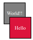
Explanation:
In the above example, we are displaying the use of the jQuery UI Droppable() method. Here, we are passing no parameter.
Example 2:
jQuery UI Droppable - Default functionality
Output 1:
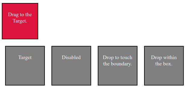
Output 2:
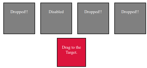
Explanation:
In the above example, we are displaying the way to use and the behavior of the addClass, disable and tolerance options in the drop function of the jQuery UI.
Example 3:
jQuery UI Droppable - Default functionality
Output 1:
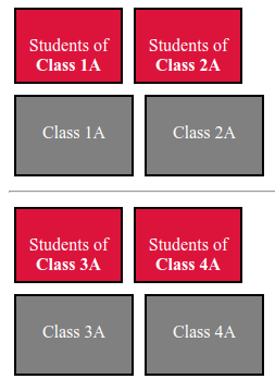
Output 2:
Output 3:
Explanation:
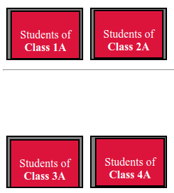
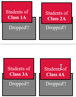
In the above example, we are displaying the way to use accept and scope options in the drag function of the jQuery UI. Drop the Students box to their respective classes to see the effect.
Example 4:
jQuery UI Droppable - Default functionality
Output 1:
Output 2:
Output 3:
Output 4:
Explanation:
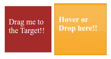
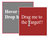
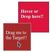
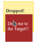
In the above example, we are displaying the effect of the activeClass and hoverClass options of jQuery UI. They are used to manage appearance. Hover on the target box and then drop to the target box to see the change in appearances.
Second Method: The droppable (“action”, params) method:
To act on droppable elements, such as preventing droppable functionality, the droppable (“action”, params) method is used. An action specified as a string is passed in the first argument. To prevent the drop, “disable” is passed as the first argument.
Syntax:
$(selector, context).droppable ("action", params);
The popular actions that can be used with this method are listed below:
| Action | Uses |
| accept | To control which draggable elements are to be accepted for dropping. The default value is *. |
| activeclass | To specify a string representing one or more css classes to be added to the droppable element when an accepted element (one of those indicated in options.accept) is being dragged. The default value is false. |
| addclasses | To restrict the ui-droppable class from being added to the droppable elements, when set to false. The default value is true. |
| disabled | To disable the droppable, when set to true. The default value is false. |
| greedy | To control which draggable elements are to be accepted for dropping on nested droppables. Any parent droppables will not receive the element, when set to true. The default value is false. |
| hoverclass | To specify a string representing one or more css classes to be added to the element of droppable when an accepted element (an element indicated in options.accept) moves into it. The default value is false. |
| scope | To restrict the droppable action of draggable elements only to items that have the same options.scope (defined in draggable (options)). The default value is “default”. |
| tolerence | To specify a string to indicate the mode to use for testing whether a draggable is hovering over a droppable. The default value is “intersect”. |
Example 5:
jQuery UI Droppable - Default functionality
Drag Me
Drag Me
Drag Me
Target 1
Target 2
Target 3
Output 1:
Output 2:

Explanation:
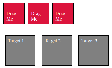
In the above example, we are displaying the use of the destroy () method:
The popular event methods in jQueryUI are listed below. Each of these gets triggered for a particular event.
| Event Method | Uses |
| activate(event, ui) | Triggered when the accepted draggable element starts dragging. It is used to make the droppable “light up” when it can be dropped on. |
| create(event,ui) | Triggered when a droppable element is created, where “event” is of type event, and “ui” is of type object. |
| deactivate(event,ui) | Triggered when an accepted draggable stops dragging, where “event” is of type event, and ui is of type object. |
| drop(event,ui) | Triggered when an element is dropped on the droppable, based on the tolerance option, where “event” is of type event, and “ui” is of type object. |
| out(event,ui) | Triggered when an accepted draggable element is dragged out of the droppable based on the tolerance option, where “event” is of type event, and “ui” is of type object. |
| over(event,ui) | Triggered when an accepted draggable element is dragged over the droppable based on the tolerance option, where “event” is of type event, and “ui” is of type object. |
Example 6:
jQuery UI Droppable - Default functionality
Output 1:
Output 2:
Output 3:
Output 4:
Explanation:
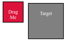
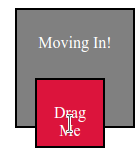
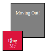
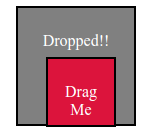
In the above example, we are displaying the use and behavior of the “drop”, “over” and “out” events during drop functionality.