Being an expandable and collapsible content holder, the jQuery UI Accordion is broken into sections. It probably resembles like tabs.
Syntax:
The accordion() method can be used in two forms:
$(selector, context).accordion (options) Method
OR
$(selector, context).accordion (“action”, params) Method
First Method: The accordion (options) Method:
To indicate that an HTML element and its contents should be treated and managed as accordion menus, the accordion (options) method is used. The appearance and behavior of the menus involved are specified by the options parameter which is an object.
Syntax:
$(selector, context).accordion (options);
Multiple options can also be used at a time using the Javascript object. For this, the options need to be separated using a comma.
Syntax:
$(selector, context).accordion({option1: value1, option2: value2..... });
The popular options that can be used with this method are listed below:
| Option | Uses |
| active | To define the index of the menu which opens when the page is first accessed. The default value is 0.
Two types of active option: boolean: It collapses all panels, when set to false. Here, the collapsible option needs to be true. integer: It is the zero-based index of the panel that is active (open). To select panels going backward from the last panel, a negative value is used. |
| animate | To set the way to animate changing panels. The default value is {}.
Two types of animate option: boolean: The animations gets disabled, when set to false. number: It is used to set a duration in milliseconds string: It is used to indicate the name of easing to use with default duration. object: It represents the animation settings with easing and duration properties. |
| collapsible | To click on the open panel’s header with no effect when set to false and to close a menu by clicking on it when set to true. The default value is false. |
| disabled | To disable the accordion, when set to true. The default value is false. |
| event | To define the event used to select an accordion header. The default value is click. |
| header | To define a selector or element to override the default pattern for identifying the header elements. The default value is > li > :first-child,> :not(li):even. |
| heightStyle | To control the height of accordion and panels. The default value is auto.
The possible values of the heightStyle option are: auto: It allows all the panels to be set to the height of the tallest panel. fill: It is used to expand to the available height based on the accordion’s parent height. content: It allows each panel to be only as tall as its content. |
| icons | To specify the icons to use to the left of the header text for opened and closed panels. It an object. The property named header specifies the icon to use for closed panels, whereas the property named headerselected specifies the icon to use for open panels. The default value is { “header”: “ui-icon-triangle-1-e”, “activeheader”: “ui-icon-triangle-1-s” }. |
Example 1:
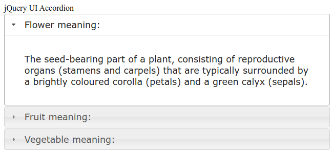
jQuery UI Accordion
Flower meaning:
The seed-bearing part of a plant, consisting of reproductive organs (stamens and carpels) that are typically surrounded by a brightly coloured corolla (petals) and a green calyx (sepals).
Fruit meaning:
The sweet and fleshy product of a tree or other plant that contains seeds and can be eaten as food.
Vegetable meaning:
A plant or part of a plant used as food, such as cabbage, potato, turnip, or bean.
Output:

Explanation:
In the above example, we are displaying the use and the behavior of the jQuery UI Accordion() method.
Second Method: The accordion (“action”, params) method:
To perform an action on accordion elements, the accordion (“action”, params) method is used. It can be used for performing actions like selecting/deselecting the accordion menu. The action here is the first argument and is specified as a string. For example, disables all the menus, the “disable” should be passed as a value to the action parameter.
Syntax:
$(selector, context).accordion ("action", params);
The actions that can be used with this method are listed below:
| Action | Uses |
| destroy | To destroy the accordion functionality of an element completely, so that the elements return to their pre-init state. |
| disable | To disable all menus. No click is thus taken into account. No argument is accepted by this method. |
| enable | To reactivate all menus. The clicks will be considered again. No argument is accepted by this method. |
| option(optionName) | To retrieve the value of currently associated accordion element with the specified optionname. A string value is taken as an argument by this method. |
| option | To retrieve an object containing key/value pairs representing the current accordion options hash. |
| option(optionName, value) | To set the value of the accordion option associated with the specified optionName. |
| option(options) | To set one or more options for the accordion. A map of option-value pairs to set is specified by the option parameter. |
| refresh | To process any headers and panels that were added or removed directly in the dom. The height of the accordion panels is than recomputed. The output thus have a dependency on the content and the heightStyle option. No argument is accepted by this method. |
| widget | To retrieve the accordion widget element; the one annotated with the UI-accordion class name. |
Example 2:
jQuery UI Accordion Example
Flower meaning:
The seed-bearing part of a plant, consisting of reproductive organs (stamens and carpels) that are typically surrounded by a brightly coloured corolla (petals) and a green calyx (sepals).
Fruit meaning:
The sweet and fleshy product of a tree or other plant that contains seed and can be eaten as food.
Vegetable meaning:
A plant or part of a plant used as food, such as a cabbage, potato, turnip, or bean.
Disable Accordion
Enable Accordion
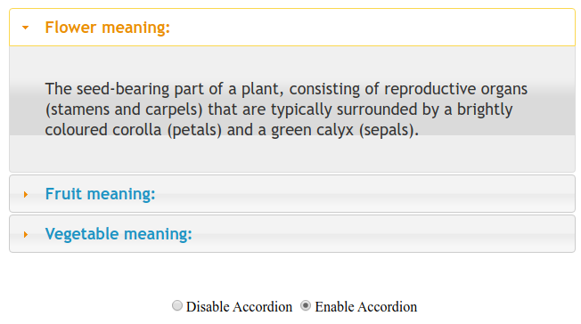
Output 1:

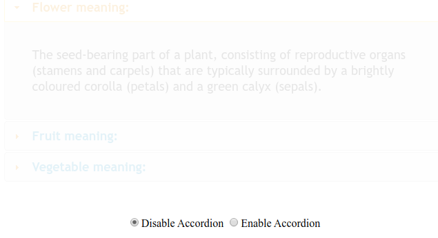
Output 2:

Explanation:
In the above example, we are displaying the use and behavior of the option (optionName, value) method. Here, we are disabling and enabling the accordion.